
Home » Reunion Charting Tips
Reunion Charting Tips
• We use Left-to-Right charts for a lot of our work because they’re a great compromise between compactness and readability, but if you are printing a chart for a family reunion, try the Top-to-Bottom format. This tends to make the chart shorter vertically and longer horizontally, perfect for spreading admirers along the wall instead of bunching them up into one narrow space. Viewers also won’t have to kneel to see the distant cousins on the bottom or squint to see the ones at the top.
• Is your Top-to-Bottom descendant chart 10 feet wide but only 8 inches high? Beef it up with the Top-to-Bottom Waterfall orientation. Create your descendant chart, select Tree—> Orientation—>Top-to-Bottom Waterfall, and set the “begin Waterfall in generation” number to be one or two less than the total number of generations in your chart. This will take all those widely spread boxes on the bottom and stack them vertically to improve your chart’s proportions. Make sure at least one dimension of your chart remains less than 60 inches so Heartland Family Graphics can print it for you on a single sheet.
• To ensure you get the best product, print a proof copy of your chart at home. Most folks have a photo quality printer nowadays, and while your output may not be exactly the same as ours, it will be close enough to get a fresh look at potential problems. This includes such things as overlooked typos as well as photo resolution and darkness. If your chart’s too big to print in its entirety, find some of the likely trouble spots and just print those pages. A little extra effort here can have significant payoff later.
• The single most effective thing a person can do to improve the appearance of a photo in a chart is to adjust its levels in an application such as Preview or Photos before adding it to the family file or chart. You can adjust levels manually (How To… ), or just use the Auto Levels function, which does a great job on most photos with a minimum of fuss. If at all possible, avoid the use of contrast and brightness controls—levels will do what you want, and do it much better. This is shown in our Adjusting Photos video.
• Use a frame on your chart. Click on the very edge of your chart in the chart editor to select the frame, and you can adjust it with the tools in the tool bar to the left. This really provides the perfect finishing touch! And consider putting a title at the top of your chart for the benefit of those folks who aren’t as familiar with your research as you are. (Something like “Descendants of John Smith and Martha White” really sets the stage for the first time viewer.) Finally, a credits box in small font in a lower corner can make it clear who did the research, who created the chart, and for what occasion.
• If you use a title or caption with a box around it, give your words some breathing room. Try adding a space or two in the front of the longest line and a space or two at the end of the longest line (if you aren’t using centered text, you’ll need to add spaces at the beginning of every other line as well). This will force the box dimensions out away from the title/caption and make your words look less cramped.
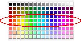
• The color presets built into Reunion for drawing family trees will always yield good results, but if you want to customize your tree colors or add new text boxes to it, keep the following color tips in mind. For the richest colors, stay away from the top of the color palette for your box fill color. As shown in the adjacent graphic, in most cases, anything above the circled colors will tend to look muddy when printed. The top colors have their uses, but use them with care. For background fill in boxes with black text, use the colors below the circled ones (the bottom row is best unless you have a specific design goal in mind). For more information about the mechanics of adding colors, take a look at our Customizing Charts video.
• Don’t use the Move Boxes Off Page Breaks option in Page Setup. You won’t have any page breaks on your Heartland Family Graphics Print, and using this option can actually force a larger page count than is necessary, not to mention creating an unbalanced appearance for your tree.
• Stick with common fonts in your charts. There are reasons why fonts like Helvetica and Times are so widely used: they’re clear, extremely readable, and have a professional flair. Make them work for you! If you still feel your chart needs something just a little different to spice it up, try the Georgia font…also very readable, but with a very nice old-timey flavor.
• When you’re done with your chart, go to File—> Page Setup and try both portrait and landscape modes for the page orientation. It can make a significant difference in the total number of 8.5″ x 11″ pages for your chart (which is used to determine the price for printing). This is for your own information . . . we’ll always look for the lowest cost for you.